Template
template section of the profile is used to define the layout of the virtual cockpit. It's a JSON object that contains a list of elements, such as buttons, switches, and knobs.
Pages
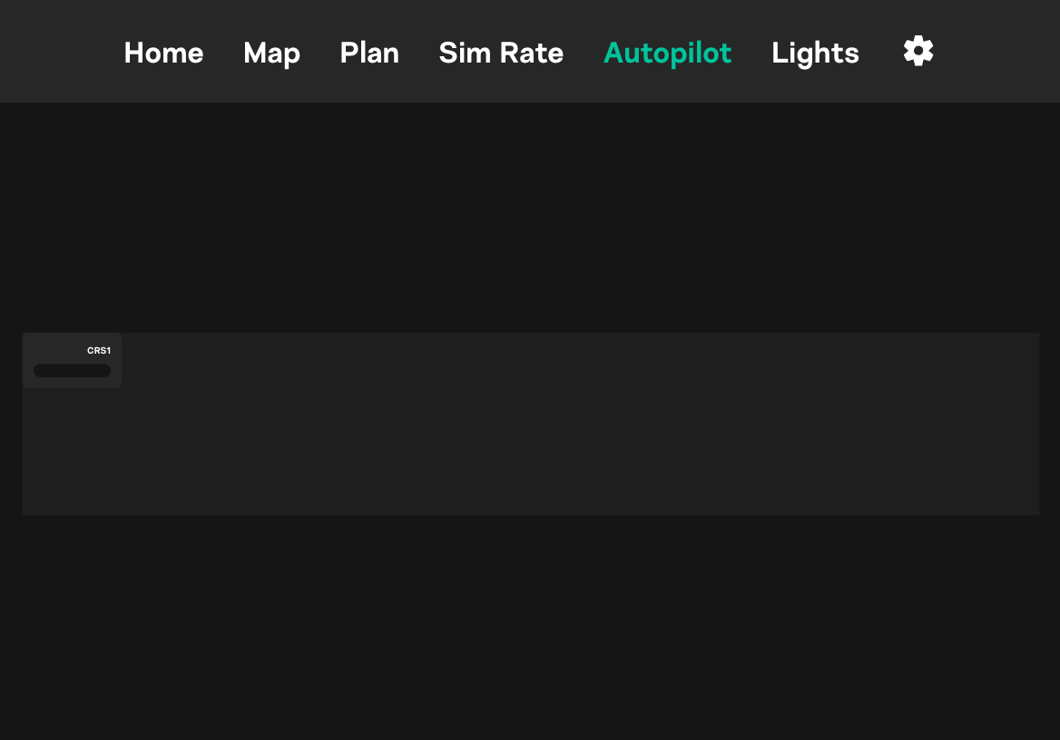
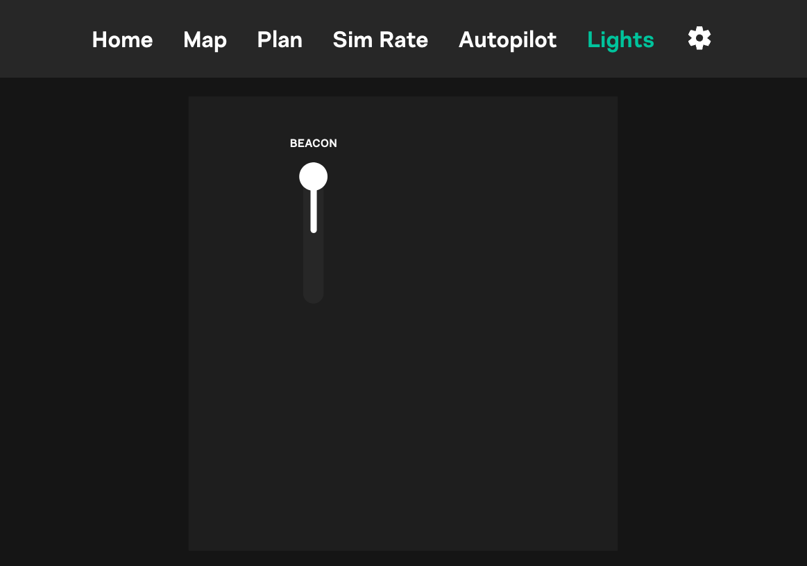
Let's start by defining 2 simple pages: autopilot and lights.
{
  "template": {
    "screen_autopilot": {
      "name":"Autopilot",
      "virtualKnobAvailable":true,
      "canvas":{
        "size":{
          "width":1532,
          "height":275
        }
      },
      "components": [
        {
          "type":"numericDisplay",
          "position":{
            "x":0,
            "y":0
          },
          "props":{
            "title":{
              "value":"CRS1"
            },
            "slotName":"crs1",
            "storeKey":"crs1Value",
            "scale":0.7,
            "width":150
          }
        }
      ]
    },
    "screen_lights": {
      "name":"Lights",
      "canvas":{
        "size":{
          "width":760,
          "height":805
        }
      },
      "components":[
        {
          "type":"switch",
          "position":{
            "x":140,
            "y":70
          },
          "props":{
            "topText":"BEACON",
            "clickAreas":2,
            "storeKey":"beaconLightPosition",
            "onPressEvents":[
              "beaconLightSwitch"
            ]
          }
        }
      ]
    }
  }
}


- Each page should be defined as a separate object with a unique key, such as
screen_autopilotorscreen_lights.screen_prefix is mandatory! name- Page name that will be displayed in the SimBox Client appvirtualKnobAvailable- If set totrue, the page will display virtual knob on the bottom if needed. This is useful for pages that require knob input, such asautopilotorradio. You can turn it off for pages that don't require knob input, such aslights.canvas- Canvas size in pixels. This is the size of the virtual cockpit screen. It's important to set the correct size, so the elements are displayed correctly and content is scaled properly.components- List of components that will be displayed on the page. Each component should be defined as a separate object.
Components
Each component should have the following properties:
type- Component type. Available types are:text- Text labelbox- Box (if you want to give a background to a group of components)button- ButtonnumericDisplay- Numeric display (for example for heading, altitude, speed)triangleKnob- Triangle knobroundKnob- Round knobroundHandleKnob- Round knob with a handlewebFrame- Web frame (for displaying web content)switch- Switch
position- Component position on the canvas. The origin(0, 0)is the top-left corner of the canvas.props- Component properties. Each component type has its own set of properties. More information about properties below.
Text
Available properties:
text- Text valuefontSize- Font size in pixels
Example:
{
  "type":"text",
  "position":{
    "x":230,
    "y":10
  },
  "props":{
    "text":"EXTERNAL LTS",
    "fontSize":35
  }
}
Box
Available properties:
style- Box style. Available styles are:width- Box width in pixels, for example100height- Box height in pixels, for example50backgroundColor- Box background color, for example#000000borderRadius- Box border radius in pixels, for example5
Example:
{
  "type":"box",
  "position":{
    "x":0,
    "y":0
  },
  "props":{
    "style":{
      "width":160,
      "height":160,
      "backgroundColor":"#0e0e0e",
      "borderRadius":20
    }
  }
}
Button
Available properties:
title- Button titlestyle- Button style. Available styles are:backgroundColor- Button background color, for example#000000borderRadius- Button border radius in pixels, for example5
width- Button width in pixelsscale- Button scale, for example0.7fontSize- Button font size in pixelsonPressEvents- List of events that will be triggered when the button is pressed, for example["toggleLight"]. Events are described in the Actions section.
Example:
{
  "type":"button",
  "position":{
    "x":26,
    "y":163
  },
  "props":{
    "title":{
      "value":[
        "FD"
      ]
    },
    "storeKey":"",
    "onPressEvents":[
      "fdButtonClick"
    ]
  }
}
Numeric Display
Available properties:
title- Display titlestoreKey- Store key that will be used to store the value. This is described in the Store section.slotName- Slow name that will be used in knob actions and virtual knob configurationwidth- Numeric display width in pixelsscale- Numeric display scale, for example0.7
Example:
{
  "type":"numericDisplay",
  "position":{
    "x":100,
    "y":100
  },
  "props":{
    "title":{
      "value":"SPEED"
    },
    "slotName":"speed",
    "storeKey":"speedValue",
    "scale":0.7,
    "width":150
  }
}
Triangle Knob
Available properties:
slotName- Slot name that will be used in knob actions and virtual knob configurationstoreKey- Store key that will be used to determine the knob position. This is described in the Store section.color- Knob color, for example#000000
Example:
{
  "type": "triangleKnob",
  "position": {
    "x": 35,
    "y": 160
  },
  "props": {
    "slotName": "apu",
    "storeKey": "apuPosition"
  }
}
Round Knob
Available properties:
slotName- Slot name that will be used in knob actions and virtual knob configurationstoreKey- Store key that will be used to determine the knob position. This is described in the Store section.color- Knob color, for example#000000hasMark- If set totrue, the knob will have a mark on the top. This is useful for knobs that have a specific positionhasInnerKnob- If set totrue, the knob will have an inner knob. This is useful for knobs that consist of two parts (upper and lower knob)hasButton- If set totrue, the knob will have a button. This is useful for knobs that have a button in the centerpreventButtonFromSpin- If set totrue, the button will not spin the knob. This is useful for knobs that have a button in the center that does not rotate with the knobbuttonText- Button textbuttonStoreKey- Store key that will be used to store the button state. This is described in the Store section.
Example:
{
  "type":"roundKnob",
  "position":{
    "x":40,
    "y":20
  },
  "props":{
    "hasMark": true,
    "slotName":"efisMins",
    "storeKey":"efisMinsKnobPos",
    "hasInnerKnob": true,
    "preventButtonFromSpin": true,
    "hasButton": true,
    "buttonText": "RST"
  }
}
Round Handle Knob
Available properties:
slotName- Slot name that will be used in knob actions and virtual knob configurationstoreKey- Store key that will be used to determine the knob position. This is described in the Store section.color- Knob color, for example#000000scale- Knob scale, for example0.7
Example:
{
  "type": "roundHandleKnob",
  "position": {
    "x": 205,
    "y": 210
  },
  "props": {
    "scale": 0.6,
    "slotName": "mapType",
    "storeKey": "mapTypePosition"
  }
}
Web Frame
Available properties:
scheme- Web frame scheme, for examplehttpport- Web frame port, for example8380location- Web frame location, for example/interfaces/mcdu/width- Web frame width in pixelsheight- Web frame height in pixelsnoConnectionMessage- Message that will be displayed when the web frame cannot connect to the servernoConnectionLink- Link that will be displayed when the web frame cannot connect to the server
Switch
Available properties:
topText- Text that will be displayed on the top of the switchbottomText- Text that will be displayed on the bottom of the switchleftText- Text that will be displayed on the left of the switchrightText- Text that will be displayed on the right of the switchclickAreas- Number of click areas. Available values are2and3storeKey- Store key that will be used to store the switch position. This is described in the Store section.0is the default position (top),1is the middle position, and2is the bottom positiononPressEvents- List of events that will be triggered when the switch is pressed, for example["toggleLight"]. Events are described in the Actions section.scale- Switch scale, for example0.7horizontal- If set totrue, the switch will be displayed horizontallywide- If set totrue, the switch will have wider head (for example landing lights switch in the A320)
Example:
{
  "type": "switch",
  "position": {
    "x": 10,
    "y": 0
  },
  "props": {
    "topText": "A/T ARM",
    "bottomText": "OFF",
    "clickAreas": 2,
    "storeKey": "atArmPosition",
    "onPressEvents": [
      "atArmSwitch"
    ]
  }
},
{
  "type": "switch",
  "position": {
    "x": 200,
    "y": 0
  },
  "props": {
    "topText": "A/T ARM 2",
    "bottomText": "OFF",
    "wide": true,
    "clickAreas": 2,
    "storeKey": "atArmPosition",
    "onPressEvents": [
      "atArmSwitch"
    ]
  }
}