CDU
In SimBox, you can create your own CDU for specific aircraft. All the examples below are based on the ATR CDU, that is already available in the SimBox Control app.
This guide will show you how to create a CDU from scratch using "pop-out" method. This means that the CDU will be extracted from the simulator and displayed in the SimBox Client app using a virtual display. You can read more about the "pop-out" method in the FMC/MCDU docs.
Initial setup
This is the base JSON structure needed for the CDU to work. More properties will be added in the next steps.
{
  "template": {
    "comp": {
      "name": "custom",
      "menu": {
        "name": "MCDU",
        "hideWhileInSimPanel": true
      }
    }
  }
}
- name - Component name. It should be set to
custom - menu - Menu properties
- name - Menu name. It will be displayed in the SimBox Client app
- hideWhileInSimPanel - If set to
true, the CDU will be hidden when SimBox Client is displayed inside the simulator toolbar panel (because it doesn't support the virtual display)
Components
CDU consists of 3 elements:
- Panel image
- Keyboard
- Display
- Pop-up messages
Panel image
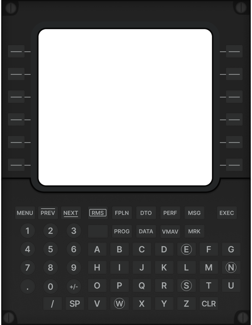
Panel image is a background image of the CDU. It can be a photo of a real CDU or a custom image (recommended). The image should be in PNG format, be high quality and have a transparent background.
Example panel image:

Please note, that there is a "hole" in the panel image where the display will be placed.
Save your panel image anywhere on your computer, but keep it mind, that the best practice is to keep all assets in the assets directory in the profile directory.
Next, update your profile JSON file:
{
  "assets": {
    "panel-atr": "C:/Users/artur/Documents/simbox-profiles/atr/assets/panel.png"
  },
  "template": {
    "comp": {
      "panelImage": "panel-atr",
      "containerSize": {
        "width": 824,
        "height": 1059
      }
    }
  }
}
assets- Assets used in the profilepanel-atr- Panel image path in the assets directory. Key name can be anything you want, you'll use it to reference the asset in the profileC:/Users/artur/Documents/simbox-profiles/atr/assets/panel.png- Absolute panel image path
template- Template propertiescomp- Page propertiespanelImage- Panel image namecontainerSize- Container size. Container size is the size of the panel imagewidth- Width in pixelsheight- Height in pixels
Keyboard
With buttons already placed on the panel image, now you need to tell SimBox where exactly are they. To do this, please follow update profile JSON file as follows:
{
  "template": {
    "comp": {
      "name": "custom",
      "buttons": {
        "eventPrefix": "mcdu",
        "types": {
          "BUTTON_1": {
            "size": {
              "width": 55,
              "height": 40
            },
            "radius": 3
          }
        },
        "buttons": [
          {
            "event": "MENU_L_1",
            "position": {
              "left": 26,
              "top": 147
            },
            "type": "BUTTON_1"
          }
        ]
      }
    }
  },
  "action": {
    "event": {
      "mcdu_MENU_L_1": {
        "events": [
          {
            "setSimVar": ["L:MSATR_MCDU1_L1", "number", 1]
          }
        ]
      }
    }
  }
}
template- Template propertiescomp- Page propertiesbuttons- Buttons propertieseventPrefix- Event prefix. It will be added to the event nametypes- Button typesBUTTON_1- Button type namesize- Button sizewidth- Button width in pixelsheight- Button height in pixels
radius- Button radius in pixels
buttons- List of buttonsevent- Button event nameposition- Button positionleft- Left position in pixelstop- Top position in pixels
type- Button type
You can have multiple button types in your CDU - for example rounded buttons, square buttons, etc. Thanks to separate button types properties, you won't have to repeat the same properties for each button.
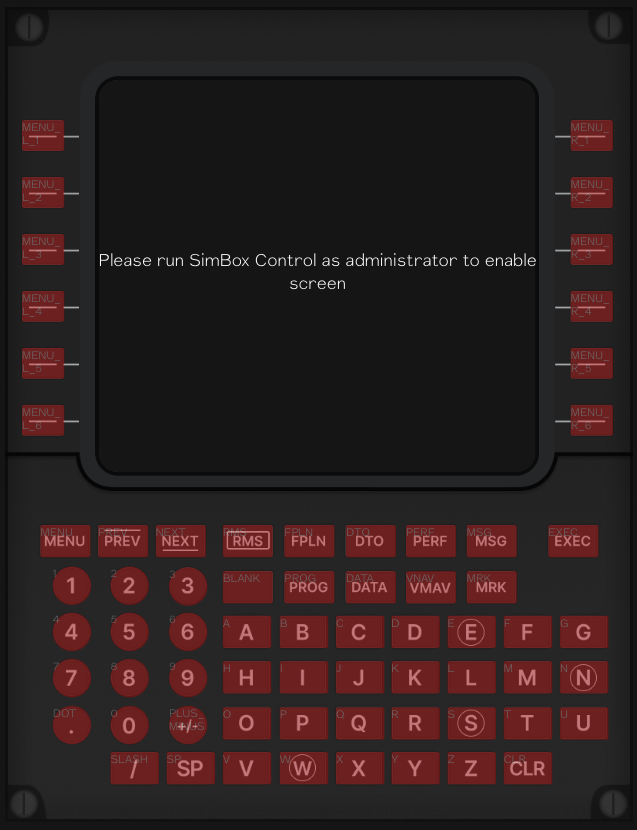
By default, buttons are transparent. Placing your buttons around the panel may be time consuming. To make it easier, you can enable the "dev mode" in the SimBox Control app. This will display a red overlay on each button, so you can see where the buttons are placed. You'll also get a text on each button with event name.

To enable dev mode, go to the "Settings" tab in the SimBox Control app and hit Ctrl + D. This will show developer input. Paste this: profileDev and hit 'Save'.
Display
Now it's time to fill the "hole" in the panel image with the display. The display is an HTML element that will stream the video from the virtual display, where the CDU should be "extracted" from the simulator and placed.
{
  "template": {
    "comp": {
      "displayContainerStyle": {
        "top": 93,
        "left": 124,
        "width": 572,
        "height": 514
      },
      "frame": {
        "width": 572,
        "backgroundColor": "#06060e",
        "videoStyle": [
          "width: 100%;",
          "transform: scaleX(1.8) scaleY(1.77);",
          "top: 108px;"
        ]
      }
    }
  }
}
template- Template propertiescomp- Page propertiesdisplayContainerStyle- Display container style. Display container is the position of the screen inside the panel image (the "hole")top- Top position in pixelsleft- Left position in pixelswidth- Width in pixelsheight- Height in pixels
frame- Frame properties. Frame is an HTML element that wraps the display and streams the video from the CDU display. You can use these properties to style the frame (for example stretch the video to fit the frame)width- Frame width in pixelsbackgroundColor- Frame background colorvideoStyle- Video stylewidth- Video widthtransform- Video transformtop- Video top position
Pop-up messages
Some CDUs have additional physical led indicators that are not part of the display. You can add them using pop-up messages. Pop-up messages are images that will be displayed on any place on the CDU template. They are activated by the store property changes.
{
  "assets": {
    "exec-light": "C:/Users/artur/Documents/simbox-profiles/737/assets/exec-flash.png"
  },
  "template": {
    "comp": {
      "popupMessages": [
        {
          "assetName": "exec-light",
          "left": 10,
          "top": 100,
          "width": 53,
          "height": 7,
          "storeProperty": "cduExecLight"
        }
      ]
    }
  }
}
assets- Assets used in the profileexec-light- Pop-up message image path. Key name can be anything you want, you'll use it to reference the asset laterC:/Users/artur/Documents/simbox-profiles/737/assets/exec-flash.png- Pop-up message image path
template- Template propertiescomp- Page propertiespopupMessages- List of pop-up messagesassetName- Pop-up message image name (from the assets)left- Left position in pixelstop- Top position in pixelswidth- Width in pixelsheight- Height in pixelsstoreProperty- Store property name. When the store property value changes totrueor1, the pop-up message will be displayed
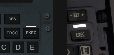
Example image (exec light that is displayed above the 'EXEC' button on the 737 CDU):
Live example (left is SimBox, right is the simulator):

Final setup
This is the final JSON structure. Please be aware that it has only one button and one event, to make it easier to understand and read.
{
  "assets": {
    "panel-atr": "atr/panel.png"
  },
  "template": {
    "comp": {
      "name": "custom",
      "panelImage": "panel-atr",
      "buttons": {
        "eventPrefix": "mcdu",
        "types": {
          "BUTTON_1": {
            "size": {
              "width": 55,
              "height": 40
            },
            "radius": 3
          }
        },
        "buttons": [
          {
            "event": "MENU_L_1",
            "position": {
              "left": 26,
              "top": 147
            },
            "type": "BUTTON_1"
          }
        ]
      },
      "displayContainerStyle": {
        "top": 93,
        "left": 124,
        "width": 572,
        "height": 514
      },
      "containerSize": {
        "width": 824,
        "height": 1059
      },
      "menu": {
        "name": "MCDU",
        "hideWhileInSimPanel": true
      },
      "frame": {
        "width": 572,
        "backgroundColor": "#06060e",
        "videoStyle": [
          "width: 100%;",
          "transform: scaleX(1.8) scaleY(1.77);",
          "top: 108px;"
        ]
      }
    }
  },
  "action": {
    "event": {
      "mcdu_MENU_L_1": {
        "events": [
          {
            "setSimVar": ["L:MSATR_MCDU1_L1", "number", 1]
          }
        ]
      }
    }
  }
}
Tips
Open SimBox Client in the browser while working on the CDU. This way you can see the changes in real-time and use build-in developer tools to inspect the elements and move them around before updating the profile.